Really cool site to "PLAY" with!!
http://www.typeisart.com/
This blog will be an essential guide to your success in this class. It is a portal for information and typographical discovery. Schedule updates and assignments regarding our class will be posted to this site. It is your responsibility to check the blog often!
Tuesday, August 7, 2012
Thursday, April 19, 2012
Tuesday, April 17, 2012
Party Time!
Hello guys! Just a couple of reminders...
Don't forget your archives and whatever you signed up for tomorrow morning!! We will have breakfast, watch Urbanized, and review material for the test.
I will be bringing Chik fil a minis!
See you in class!
Don't forget your archives and whatever you signed up for tomorrow morning!! We will have breakfast, watch Urbanized, and review material for the test.
I will be bringing Chik fil a minis!
See you in class!
Monday, April 9, 2012
Sunday, April 8, 2012
Project 4: Binding your books!
Signatures = Spreads
These videos are showing books much larger (thicker) than what you have to do. But, they will refresh your memory on the binding demo we had.
Below see a PDF with directions on how to Saddle Stitch your books (Using spreads)
http://www.citationsoftware.com/QUIT/HowToCreateABookletWithQI_or_QIPlus.pdf
Below see videos that are showing how to bind books much larger (thicker) than what you have to do. But, they will refresh your memory on the binding demo we had.
http://youtu.be/PGqmtuMAhGk
http://youtu.be/hdwDYVlZK2A
http://youtu.be/cXdK74_SCZQ
Friday, March 30, 2012
Wednesday, March 28, 2012
Project 4 visual resources
Plus some more visuals here:
http://www.youthedesigner.com/2009/01/30/18-beautiful-brochure-design-samples/
Thursday, March 22, 2012
Interesting Study
http://retinart.net/typography/marksunknown/
Typographic Design Patterns and Best Practices
http://www.smashingmagazine.com/2009/08/20/typographic-design-survey-best-practices-from-the-best-blogs/
Wednesday, March 21, 2012
In Class Exercise on Monday
Don't forget to bring magazines, scissors and glue! We are going to have some fun and creative time!
Parts are important, but the whole is what really matters!
Look at your projects as a whole... Each page matters,
but the book as a whole piece needs to work as a unit!
but the book as a whole piece needs to work as a unit!
Church banners malfunction!
Tuesday, March 20, 2012
Choosing a Typeface
From Aaronda:
Hello,
Just wanted to make this great resource available to everyone. It really helps when deciding a typeface to use for a specific project. Many of the typefaces that you allow us to use are on there as well.
Hello,
Just wanted to make this great resource available to everyone. It really helps when deciding a typeface to use for a specific project. Many of the typefaces that you allow us to use are on there as well.
Wednesday, March 7, 2012
More Great Example of Typography & Layout
http://www.tumblr.com/tagged/typography
http://www.tooft.com/47-amazing-typography-inspirations/
Thank you Charity and Dana!
http://www.tooft.com/47-amazing-typography-inspirations/
Thank you Charity and Dana!
Tuesday, March 6, 2012
Monday, March 5, 2012
Magazine Spreads for 3/7/12
For next class, please bring a magazine spread out of your favorite publication. Choose a spread layout that was designed on a grid and that is attractive. We will pin up everyone's examples and talk about the grids and layout design in each spread. This should give you all a bank of visual examples to draw from.
Wednesday, February 29, 2012
Grid Resources
This is my favorite resource: http://www.thinkingwithtype.com/contents/grid/
http://www.markboulton.co.uk/journal/comments/five-simple-steps-to-designing-grid-systems-part-1
http://www.markboulton.co.uk/journal/comments/five-simple-steps-to-designing-grid-systems-part-2
http://www.markboulton.co.uk/journal/comments/five-simple-steps-to-designing-grid-systems-part-1
http://www.markboulton.co.uk/journal/comments/five-simple-steps-to-designing-grid-systems-part-2
Wednesday, February 22, 2012
Monday, February 20, 2012
Saturday, February 18, 2012
Typography X Logos Quiz - FUN
If you need help, scroll to October 16th of the comments and Rob Cubbon announces the answers.
"It's funny how we are exposed to so much information daily but cannot remember specific details of that information."
Thank you Aaronda for the link!
Thursday, February 16, 2012
Have some fun!
http://cheeseorfont.com/
Kirsten sent me this website. Don't forget to participate in the blog. Thank you Kirsten!
Kirsten sent me this website. Don't forget to participate in the blog. Thank you Kirsten!
Saturday, February 11, 2012
Typographic Checklist
Great resource to check before you tuen in your projects:
https://docs.google.com/open?id=0B7wRkTp3nBt2ZGEwNWJmMWYtZGJkNi00MWRlLThhYjAtNGRiMzRjNzYyY2Y4
https://docs.google.com/open?id=0B7wRkTp3nBt2ZGEwNWJmMWYtZGJkNi00MWRlLThhYjAtNGRiMzRjNzYyY2Y4
Monday, February 6, 2012
Friday, February 3, 2012
Sunday, January 29, 2012
Black Board Cutting & Mounting
Craftsmanship is very important!! Mount your work appropriately!
Materials:
• exacto knife with extra blades
• studiotac dry adhesive or spray mount
• T-square
• cutting mat
• black board
• fine sand paper block.
Process:
• Make sure you have a clean work area
• When attaching the paper, make sure to use a roller or something similar to flatten your paper into the board so that there are no air bubbles.
• When measuring, make sure your pencil marks are light and accurate.
• When cutting, use a repetitive motion with several light cuts instead of trying to go through the thickness of the board at once.
• After the project is mounted, make sure to use the sand board to smooth the edges if necessary
• Make sure that there are no visible glue or pencil marks.
• Make sure that you leave a nice margin all the way around, don’t crowd your board.
• Make sure that the backs of your boards are clean and with you identification label.
• Make sure that the boards are consistent throughout.
As a quick reference, take a look at this GSU student's video. She covers the steps to mount your boards for presentation. I will go into a little more detail in class, but you can always refer back to this video if you have too!
http://youtu.be/Aq2sJ1kUdHs
Thursday, January 26, 2012
Wednesday, January 25, 2012
Tuesday, January 24, 2012
Free 27 Page Type Classification eBook
The design is visually busy, but there's lots of good information here!
http://justcreativedesign.com/featured-articles/type-classification-ebook/
http://justcreativedesign.com/featured-articles/type-classification-ebook/
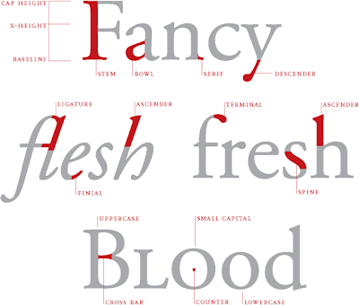
New Handouts: Type Anatomy & Type Classification
Check out the helpful links for these study guides. They cover the materials that are not in your textbook.
Sunday, January 22, 2012
Thursday, January 19, 2012
Font and Typeface?
Type Tips, Typography Basics | Yves Peters | September 11, 2008 | fontfeed.com
As we’re collaborating with multiple authors on the FontFeed, we compiled a list of guidelines for ourselves and guest contributors. One of our concerns is that we should attempt to “speak the same language” when using typographic and related terms. Because these terms evolved over a considerable period of time and saw several transitions in technology, they can sometimes be interpreted in varying ways. This resulted in a terminology that is often perceived as at best esoteric, at worst plain confusing.
The first terminology we agreed upon was in which situations we’d use font and whentypeface. Mark Simonson once recapped it handsomely in this discussion on Typophile. The gist of it is that
the physical embodiment of a collection of letters, numbers, symbols, etc. (whether it’s a case of metal pieces or a computer file) is a font. When referring to the design of the collection (the way it looks) you call it a typeface.
Nick Sherman used an interesting analogy in a comment on Typographica’s Our Favorite Typefaces of 2007:
The way I relate the difference between typeface and font to my students is by comparing them to songs and MP3s, respectively (or songs and CDs, if you prefer a physical metaphor).
Stephen Coles agrees:
When you talk about how much you like a tune, you don’t say: “That’s a great MP3”. You say: “That’s a great song”. The MP3 is the delivery mechanism, not the creative work; just as in type afont is the delivery mechanism and a typeface is the creative work.
Norbert Florendo commented with this concise explanation:
font is what you use, and typeface is what you see.
More Resources
Website to identify typefaces:
http://www.identifont.com/index.html
Great article about typography:
http://www.smashingmagazine.com/2011/02/15/useful-typography-tips-for-adobe-illustrator/
http://www.identifont.com/index.html
Great article about typography:
http://www.smashingmagazine.com/2011/02/15/useful-typography-tips-for-adobe-illustrator/
Tuesday, January 17, 2012
Example of letter Anatomy Composition
Very nice composition. Time permitting, we will try an exercise like this!
Letter Anatomy by ~SweetThye
| ©2011-2012 ~SweetThye |
Sunday, January 15, 2012
Saving your files
Please use the following directions to name your files for this class, including exercises and projects:
Individual files: lastname_firstname_projectX or lastname_firstname_projectX
(example: lord_katia_exercise1)
Folders: lastname_firstname_GRD3150S12
(example: lord_katia_GRD3150S12)
Individual files: lastname_firstname_projectX or lastname_firstname_projectX
(example: lord_katia_exercise1)
Folders: lastname_firstname_GRD3150S12
(example: lord_katia_GRD3150S12)
Save natives and PDF files in the KLord-GRD3150-S2012 folder in shared space by the end of this class period.
Tuesday, January 10, 2012
Inspiration and/or type Resources
http://ilovetypography.com/
Lots of great articles about type - also a lot of links to other type resources.
http://www.fonts.com/
Mostly use to purchase fonts - but has some resources on it as well
http://www.typographyserved.com/
A cool site for inspiration
http://www.rsub.com/typographic/
Cool resources - has some info on the history and evolution of type as well.
More to come as we progress in the class. Please feel free to comment with
more resources or inspirations that you find and want to share regarding
typography and font!
Monday, January 9, 2012
Thursday, January 5, 2012
Welcome to Introduction to Typography
In this course, you will learn the art of designing with type. I hope you develop an appreciation for typography and that you learn how to use it to strengthen your designs. Typography is an integral part of Graphic Design, and masterful use of type separates the really good designers from those who are just so-so...it does make a difference!
For class, you will need the book Designing With Type 5 by James Craig and Irene Korol Scala. Copies can be found in the school bookstore. Another great book that is not required, but is recommended, is Thinking With Type by Ellen Lupton Exercises and assignments will also be posted in this blog. You will have numerous exercises over the course of this semester in addition to your major projects. Please check this blog weekly.
For now, that's it! Looking forward to a great semester! See you Wednesday!
Subscribe to:
Comments (Atom)


